
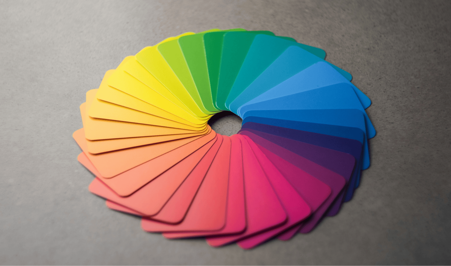
You’ve probably been told that choosing colours is almost scientific. Pick blue if you want trust. Green for sustainability. Red if you want people to act. It all sounds wonderfully straightforward.
Except… it isn’t.
The funny thing is, the people who’ve spent their careers studying colour are often the first to tell you it doesn’t behave predictably.
That’s why I don’t see colour theory as a set of rules. I see it as a language. The more fluent you become, the more confidently you know when to follow convention and when to ignore it completely.
Colour isn’t something we experience in isolation. It’s contextual, relational and deeply personal. The same shade can feel calm in one setting and energetic in another. It can communicate authority to one audience and something entirely different to another.
Understanding why that happens is what allows brands to use colour more thoughtfully and, ultimately, more distinctively.
Where Did Colour Theory Come From?
Like most design theories, colour theory began with someone trying to make sense of something wonderfully complicated.
In the 17th century, Isaac Newton used a prism to split white light into the spectrum of visible colours before arranging them into the first colour wheel. His work brought scientific structure to something that had previously been wrapped up in philosophy and art.
Fast forward to the Bauhaus movement, and this is where things get really interesting.
Rather than arriving at one definitive theory, several influential designers developed completely different ways of understanding colour.
Johannes Itten introduced his famous colour star and identified seven different types of contrast, including hue, light and dark, warm and cool, complementary colours, analogous colours, saturation and extension. Wassily Kandinsky believed colours, shapes and emotions shared fixed relationships that could be deliberately used in design.
Then came Josef Albers.
His view challenged almost everything that came before. He argued that colour has no fixed identity because “a colour is almost never seen as it really is.” Instead, every colour changes depending on what surrounds it.
That’s the part I love.
Even the people who built modern colour theory couldn’t agree on whether colour followed fixed rules. If the experts were debating it back then, maybe we shouldn’t treat today’s colour psychology listicles as absolute truth either.

Before We Break The Rules, Let’s Learn The Language
I still use these principles every day. Not because they tell me which colours to choose, but because they give me the vocabulary to explain why something works… or doesn’t.
Every colour has three core properties.
- Hue is the colour itself, such as blue, green or orange.
- Value, sometimes called lightness, describes how light or dark that colour appears.
- Saturation, also known as chroma or intensity, describes how vivid or muted it feels.
From there, we build relationships between colours. Primary colours combine to create secondary colours, while mixing those together creates tertiary colours.
You’ll also come across familiar arrangements on the colour wheel, including complementary, analogous, monochromatic, triadic and split complementary palettes. Each offers different levels of contrast, balance and visual interest.
These ideas are genuinely useful. They help designers communicate, experiment and solve problems together.
But they’re the vocabulary, not the verdict.
Think of the colour wheel as the start of the conversation rather than the final answer.
Colour Gets More Complicated Online
One of the biggest surprises for clients is discovering that one colour isn’t actually the same colour everywhere.
That’s because screens and print work in fundamentally different ways.
Digital devices use RGB, an additive colour system that creates colour by combining red, green and blue light. Printing uses CMYK, a subtractive process that layers cyan, magenta, yellow and black inks onto paper. Even if you choose exactly the same brand colour, it won’t necessarily look identical across both systems.
It gets even more complicated because every screen is different. Brightness settings, monitor quality and device calibration all influence how colours appear. The blue you see on your laptop may look noticeably different on someone else’s phone.
That’s one reason professional branding often includes Pantone or spot colours for printed materials, helping businesses achieve greater consistency across packaging, signage and marketing collateral.
Designing with colour today means accepting that consistency isn’t about making every version identical. It’s about making every version feel recognisably part of the same brand.
Good Colour Is Accessible Colour
Here’s the other thing: beautiful colour combinations aren’t much use if people can’t actually read them.
Around one in twelve men and one in two hundred women experience some form of colour blindness. That’s hundreds of millions of people worldwide.
The most common form affects the ability to distinguish between reds and greens, but colour blindness isn’t simply seeing the world in black and white. It exists on a spectrum, which means colours that appear perfectly clear to one person may become difficult to distinguish for someone else.
Contrast matters just as much.
Strong colour contrast improves readability, supports accessibility standards and makes digital experiences easier for everyone to use, whether they’re viewing your website in bright sunlight or navigating it with reduced vision.
At TH3, accessibility isn’t something we check at the end of a project. It’s part of choosing the colour palette in the first place. If a colour combination doesn’t work for the people using it, it isn’t doing its job.
This Is Where Colour Gets Interesting
Once you understand the fundamentals, this is where the fun begins.
Colour Doesn’t Mean The Same Thing Everywhere
One of the biggest misconceptions in branding is that colours carry universal meanings because of psychology.
They don’t.
Red is often associated with passion, excitement or urgency across much of the Western world. In China, it’s traditionally linked with luck and celebration. In South Africa, it has associations with mourning, while in Russia it has long carried political and historical meanings.
That’s why those fun “what your brand colour says about you” quizzes only take you so far.
Colour psychology isn’t wrong. It’s simply incomplete. Meaning depends on culture, context and experience as much as the colour itself.
Context Changes Everything
One of my favourite ideas comes from Josef Albers.
Throughout his landmark book Interaction of Color, he explored the idea that colours can only really be understood in relation to the colours around them. The exact same shade can appear brighter, duller, warmer or cooler simply because you’ve changed the background.
That’s the principle of relativity, and it’s surprisingly easy to spot once you know what you’re looking for.
Context matters in branding too.
Imagine creating a fast-food logo using bright yellow and red because the colour wheel says they’re energetic and complementary. Technically, it works. Practically, your audience might immediately think of McDonald’s.
Sometimes the challenge isn’t finding colours that work together. It’s finding colours that belong uniquely to you.
Harmony Isn’t About Playing It Safe
Another idea I come back to again and again is that harmony isn’t the same as predictability.
Instead of asking whether colours are complementary, I find it more useful to think about adjustable dials.
- How much contrast is there between light and dark?
- What feelings do these colours communicate about the brand’s core values (bright, energetic, calm)?
- Is this combination balanced?
- Does it allow me to be creative in how it’s applied?
- Is this combination legible?
Changing any one of those factors can dramatically alter how energetic or calm a palette feels.
There’s also something designers call vibration. Occasionally, two highly saturated complementary colours placed directly beside one another create an uncomfortable visual effect that almost seems to shimmer. On paper, the pairing is technically correct. In practice, it can be hard to look at.
The most memorable colour palettes often balance familiarity with a little surprise. They’re related enough to feel intentional but different enough to hold your attention.
Knowing When To Trust Your Eye
Design isn’t maths.
Research, theory and testing all matter, but eventually there comes a point where you have to trust your judgement.
Some designers call this a gut check. Josef Albers encouraged students to treat colour exercises as experiments rather than absolute rules.
I think that’s where the most interesting branding happens.
Brands that break expected colour conventions, introduce unusual combinations or create just the right amount of visual tension are often the ones we remember long after everyone else has blended into the background.
How Do We Choose Colours at TH3?
If you come to us for branding or graphic design services, we won’t start by asking which colours are trending.
We start by asking what your audience needs to feel.
From there, we look at the competitive landscape, how your brand needs to stand apart, where your identity will appear and how people will experience it across print and digital.
Accessibility is built into the process from the beginning, not added as a final check. We also think carefully about the emotional qualities a colour palette should communicate, without assuming one colour always carries one meaning.
Colour theory absolutely plays a part.
It just isn’t the only voice in the room.
Great Colour Choices Start With Great Questions
Colour theory isn’t there to limit creativity. It’s there to help you understand why certain choices work, why others don’t, and when it’s worth breaking convention.
The brands people remember aren’t always the ones that followed every rule. More often than not, they’re the ones that understood the rules well enough to bend them with confidence.
That’s the difference between choosing colours because a chart told you to, and choosing colours because they genuinely fit your brand.
I think that’s what I enjoy most about working with colour. There isn’t a perfect answer waiting to be discovered. There’s a series of thoughtful decisions that gradually become the right answer for that particular brand.
At TH3, we help brands build colour palettes that feel distinctive, accessible and genuinely aligned with who they are. If you’re ready to move beyond safe colour choices, we’d love to help.
Get in touch and let’s create a brand that people remember for all the right reasons.
Sources
- Andy Tindale (2019). A Complete Guide to Colour Theory in Web Design. Kanuka Digital.
- Anon (n.d.). Interaction of Color. Josef & Anni Albers Foundation.
- Anon (2022). About Colour Blindness. Colour Blind Awareness.
- Anon (2026). Colour Stimulation. Colormoods.co.
- Archit Jha (2017). A Primer to Colors in Digital Design. Medium.
- Christopher Baird (2015). Why are red, yellow, and blue the primary colors in painting but computer screens use red, green, and blue? Science Questions with Surprising Answers.
- Emilia Novak (2025). The Science of Color: How Artists Use Color Theory to Evoke Emotion. Composition Gallery.
- Ingrid Fetell Lee (2018). Where joy hides and how to find it. TED Talks.
- Kira Straub (2023). Interaction of Color: The Importance of Joseph Albers to Color Theory. Medium.
- Maristella Casciato, Gary Fox and Katherine Rochester (2019). Color. The Getty Research Institute.
- Ruxandra Duru (2020). Two-Color Combinations: A Toolkit. Medium.
- Ruxandra Duru (2025). Rethinking Color Theory. Google Design.