
AI image tools have been almost there for a while now.
They’ve been great at creating moodboards, abstract visuals, or slightly chaotic concept art… but when it comes to actual design work? Layouts, legibility, hierarchy – that’s where things have traditionally fallen apart.
Now, OpenAI has released ChatGPT Images 2.0, a major upgrade to its built-in AI image generator. And this time, it’s not just about prettier pictures. It’s about detail.
Text actually renders properly (finally). It delivers more accurate, detailed compositions. Now there is also a ‘thinking’ step before each image generation, suggesting this model plans before it produces.
So naturally, the question is: can this tool now hold its own in a real design workflow?
Let’s take a look.
What is ChatGPT Image Generator 2.0?
If you’ve used ChatGPT recently, you’ve probably already come across it.
The ChatGPT AI image generator is now built directly into the platform, so there’s no jumping between tools, no separate software. You can go from idea → prompt → visual in one place.
But this latest version feels different.
Compared to earlier tools (and earlier versions), a few key things stand out:
- It treats your prompt more like a brief, not a vague suggestion
- Text rendering is significantly improved – headlines, labels, UI copy actually hold up
- You can generate multiple images from a single prompt
- You’ve got control over aspect ratios (from wide banners to portrait formats)
- Two modes:
- Instant (fast, free, good for quick ideas)
- Thinking (slower, more considered, better results)
That thinking mode is the interesting bit. Instead of jumping straight into image generation, it pauses, searches for relevant context if needed, and plans the layout first. All three tests below were run using Thinking mode – so what you’re seeing is the model at its most considered.
But does that actually translate into better outputs?
Putting it to the Test
Rather than throwing random prompts at it, I treated this like a real design workflow.
Each prompt was written like a client brief – clear, structured, and outcome-focused. Because here’s the thing: AI output is only ever as good as the direction you give it. Just like working with a designer.
I tested three scenarios, increasing the level of detail across each one to see how far I could push the results.
Test 1: Basic
Prompt
Create an infographic explaining how AI image generation works in ChatGPT. Include the stages: Prompt Input, AI Processing, Image Generation, Final Output. Include labels for each stage.
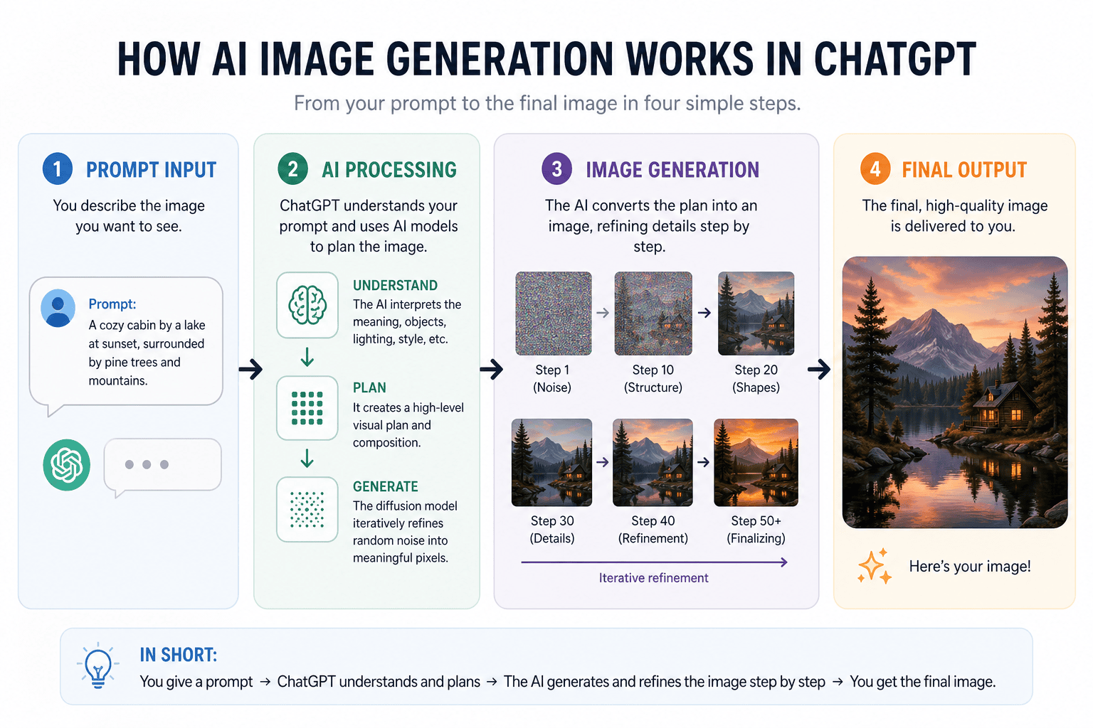
While the overall structure is logical and the stages are clearly labelled, the execution feels overly busy for what should be a simple diagram. The spacing is quite tight in places, and there’s a lot competing for attention – icons, text blocks, step visuals – which makes it harder to quickly grasp the core idea. Instead of reducing complexity, it slightly overwhelms it.
The hierarchy is there, but it could benefit from being pared back; fewer visual elements, more breathing room, and a clearer focus on the key stages would make it far more effective and easier to digest at a glance.
Verdict: Useful as a rough starting point, but too cluttered to hand to a client without significant refinement.
Test 2: Detailed
Prompt
Create a cute and cosy website homepage design for a café called The Bean. Headline: “Your New Favourite Spot”. Subheading: “Fresh coffee, homemade treats, and a warm welcome”. Add sections below the hero for Featured Drinks, About Us, and Customer Reviews. 50s retro-style. Use a white background with dark text. Include brand colours colours: #fe9c97, #e3aaa5, #f9c4bc, #d5e5e2, #54b9b4. Include small decorative illustrations or icons to enhance the cosy feel. Format as a 16:9 website-style layout.
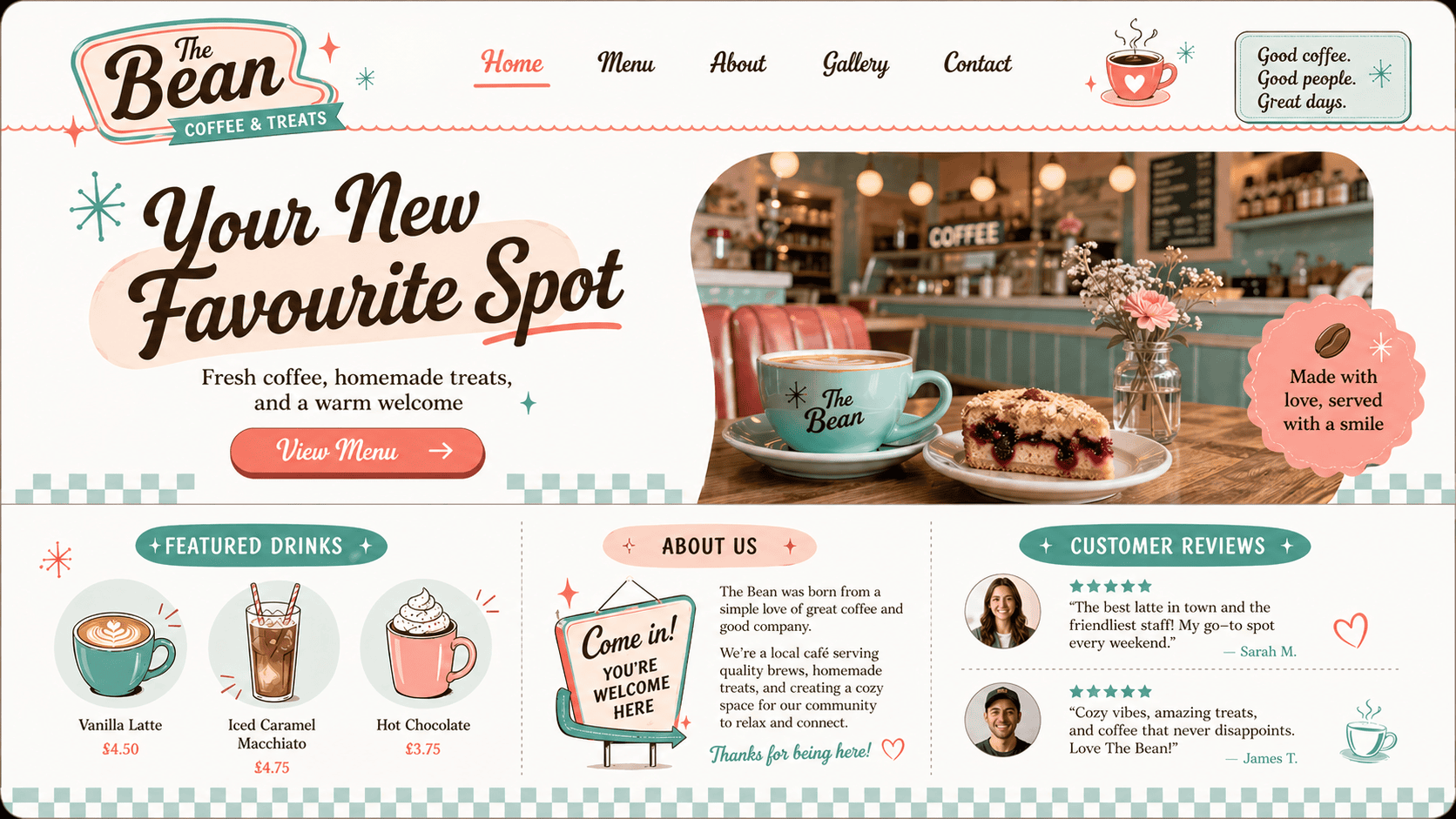
This is a noticeable step up in terms of quality and detail. The layout follows a clear homepage pattern with a defined hero, supporting sections, and a logical hierarchy that mirrors how a real website would be built.
The prompt specificity really pays off here – brand colours are used consistently, the retro style is interpreted well, and the overall tone feels cohesive and considered. The imagery, especially the hero photograph, lands convincingly and avoids the usual AI feel, which helps sell the concept.
That said, it still sits somewhere between a polished mockup and a finished design. The design is cluttered, for a website there are few CTAs, there are spacing issues, inconsistent UK and US spellings, and of course all of these elements would need to be recreated before taking the next step. It’s not development-ready, but it’s more than enough to communicate a strong visual direction.
Verdict: Strong enough to use as a concept presentation. A client would understand exactly where this is heading.
Test 3: Advanced
Prompt
- Create a high-quality Instagram post for a premium skincare brand called LUMA Skin.
- Headline text: “Glow Starts Here”. Subtext: “Clinically proven skincare for radiant results”. Include a call-to-action button: “Shop Now”. Use elegant typography and ensure all text is perfectly legible.
- Include a product visual (serum bottle) centred in the design.
- Style: clean, premium, minimal with a luxury feel. Use a soft neutral colour palette with #F5F5F5, #EADFD7, and #CBAE9E.
- Layout should feel like a real, polished Instagram ad. Include subtle shadows and depth for realism.
- Format as a portrait Instagram post.
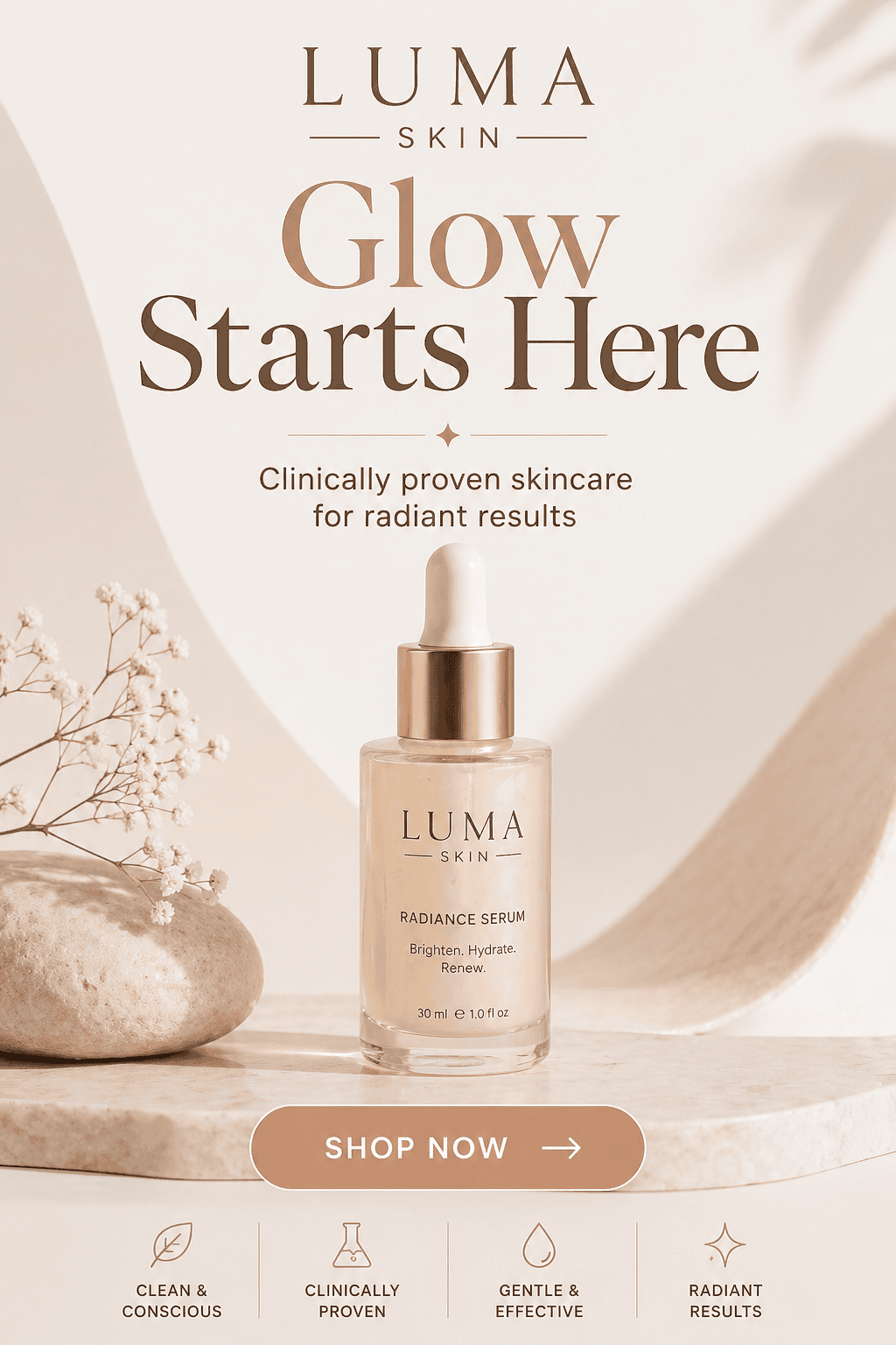
This is where things start to feel genuinely close to design-ready. The overall composition is strong with a clear hierarchy, well-balanced spacing, and a confident focal point with the product centred exactly where you’d expect it. The typography is clean and, importantly, fully legible, which is a big step forward compared to earlier AI outputs.
The tone lands well too: soft, minimal, and premium without feeling forced. Colour usage is consistent, shadows add a nice sense of depth, and the whole piece feels cohesive rather than assembled.
That said, it’s not flawless. Elements like the icon row at the bottom feel slightly generic, and while everything works, it doesn’t yet have that distinct, ownable brand edge you’d expect from a finished campaign asset.
Verdict: The closest of the three to something you could actually use. With a designer’s polish, this could go live.
What I Learned About Prompting
If there’s one clear takeaway, it’s this: the better the brief, the better the result.
When prompts were vague, the output felt generic. When they were specific – with clear hierarchy, exact copy, colour codes, and layout direction – the results became genuinely usable.
Think of it less like a search engine and more like briefing a junior designer. The more clearly you communicate what you need, the less you’ll have to fix afterwards.
Where It Performs Well
There’s a lot to like here. ChatGPT’s AI image generator is genuinely useful for:
- Fast concept generation and early-stage ideation
- Marketing mockups and social content
- Helping clients visualise ideas quickly
- Giving non-designers a way to create something presentable
Where It Still Falls Short
But it’s not perfect (and probably never will be). It still struggles with:
- Complex or layered compositions
- Fine detail and pixel-perfect spacing
- Consistency across a full design system
- Non-English text (still a bit hit and miss)
And most importantly, anything that needs to go live, to print, or to production still needs a designer’s eye.
Is It Actually Useful?
Short answer? Yes.
Longer answer? It depends how you use it.
In a real workflow, this isn’t replacing tools like Figma or Photoshop. It’s not here to finish the job. But it is incredibly useful at the start. It helps you explore ideas faster, visualise directions earlier, and give clients something tangible to react to.
That’s valuable. Because good design isn’t just about the final output, it’s about the process of getting there.
Right now, ChatGPT Images 2.0 feels like a strong concept tool. A way to move quicker, think visually sooner, and reduce that early-stage friction. Just don’t expect it to replace professional designers.
Need Design That Goes Beyond AI? Let’s Talk
AI tools like this are genuinely exciting. They open doors, speed things up, and make design more accessible.
But there’s always a point where tools stop and thinking starts.
At TH3, we use tools like this to explore ideas faster. But when it comes to building brands, refining details, and creating something that actually works in the real world – that’s where experience matters.
If you’re looking for graphic design that goes beyond quick visuals and actually delivers results, we’d love to help.Get in touch and let’s create something that works hard for your brand.