
Ah, Comic Sans. The font everyone loves to hate.
If you’ve spent any time online, chances are you’ve seen it ridiculed in memes, design forums, or even found the entire website dedicated to banning it. But here’s the twist: Comic Sans isn’t a bad font. It’s just one that was misunderstood, misused, and a little too available.
Let’s break down what Comic Sans actually is, why it works, and why designers still wince when they see it.
Comic Sans’ Origins: Built for a Cartoon Dog
It all started in 1994 at Microsoft. Designer Vincent Connare was working on a program called Microsoft Bob – a friendly interface aimed at first-time computer users. One of its characters, a cartoon dog, spoke in speech bubbles… typed out in Times New Roman.
Connare knew that font didn’t match the tone. Inspired by comic books like Watchmen and The Dark Knight Returns, he set out to create a typeface that looked more handwritten, more fun, and much more fitting for a talking dog.
Although the font didn’t make it into Microsoft Bob, it was later bundled with Windows 95 and quickly became one of the most used fonts in the world.

On his infamous design, Connare would later say:
“If you love Comic Sans, you don’t know anything about typography. But if you hate Comic Sans, then you don’t know anything about typography either…and you should get another hobby”.
Why Comic Sans Works: Casual, Clear, Surprisingly Clever
Designed for readability
It might not win any design awards, but Comic Sans does exactly what it was made for. Its letter shapes are clear and distinct – great for small screens, early readers, and those with dyslexia. Its lack of anti-aliasing support back in the day meant it remained legible on low-res screens too. Function first.
Instantly approachable
There’s something familiar about it. The uneven strokes and rounded edges give it a handwritten feel without veering into messiness. It feels friendly, relaxed and welcoming, traits that made it the font of choice for school flyers and birthday invites everywhere.
Universally available and easy to use
Because it shipped with Windows 95 and sat near the top of the font list, Comic Sans was right there when millions of people were learning to use a computer. For many, it was the first “fun” typeface they could access and apply. That ubiquity made it beloved – and also cursed.
Why Is Comic Sans Hated? The Design World’s Scapegoat
The backlash didn’t start because Comic Sans is badly designed. It started because it was used badly – a lot.
It showed up in serious settings where it clearly didn’t belong: gravestones (really), court documents, scientific research slides. That mismatch of tone made it a punchline.
Designers argued that its childish aesthetic undermined the seriousness of the message. Movements like Ban Comic Sans took things even further, turning the font into a kind of typographic villain. Memes, merch, and angry blog posts cemented its status as the world’s most hated font.
Designer Dave Combs, founder of the Ban Comic Sans movement, called it “a blight on the landscape of typography.”
But let’s be real: the problem wasn’t Comic Sans. It was the lack of thought behind its use.
Where You’ve Seen It: Schools, Signs… and Switzerland?
Despite the criticism, Comic Sans has always had fans in the right contexts:
- Schools, children’s books, and learning platforms (easy to read, especially for kids)
- Signage in hospitals, community centres, and public services
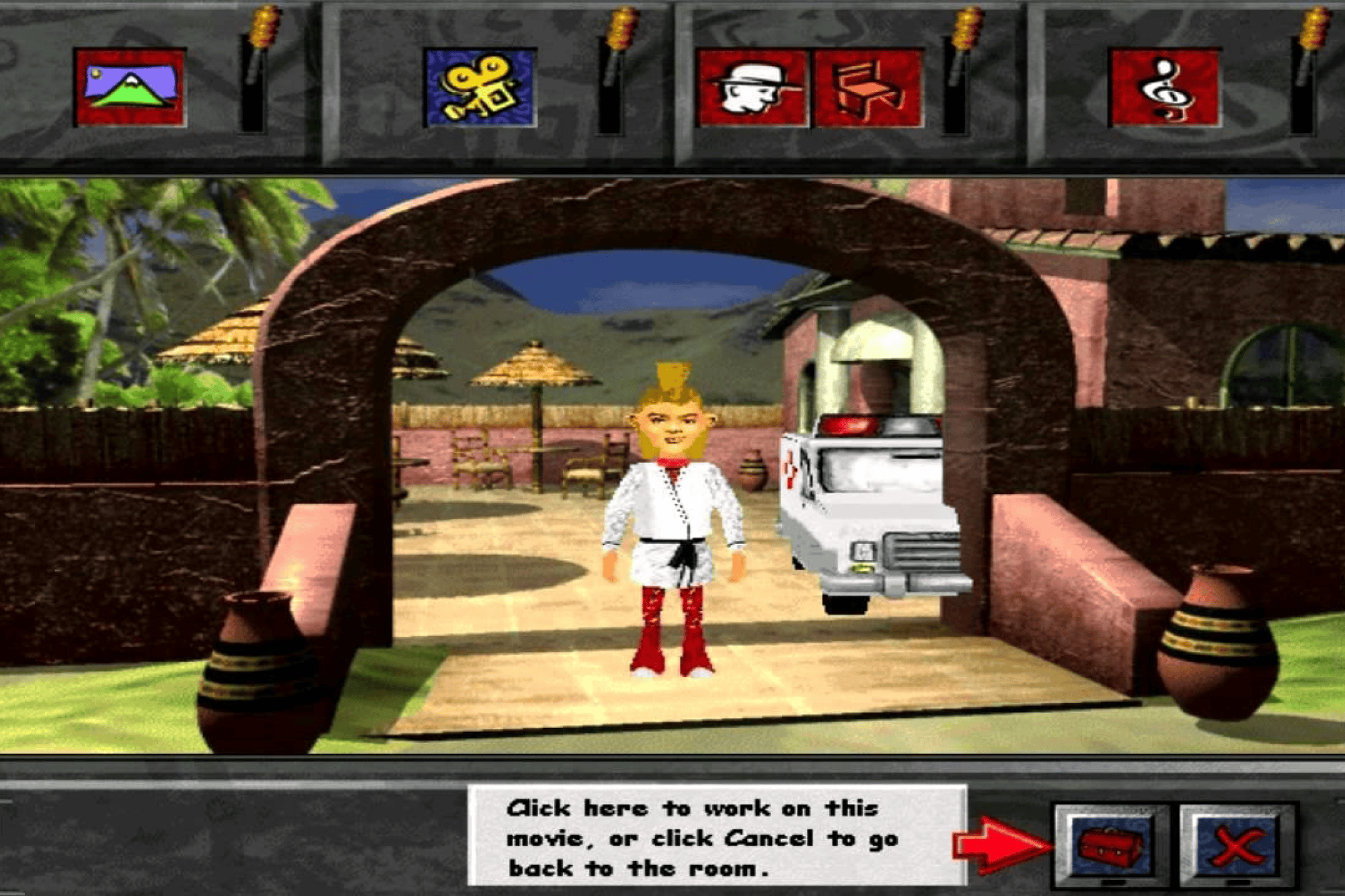
- Microsoft 3D Movie Maker and other nostalgic software tools
Even Cern’s announcement of the Higgs boson discovery used Comic Sans in its slideshow – which raised quite a few eyebrows.
“It does get misused, usually because somebody just loves it. Things like the slideshow at Cern, where they announced the Higgs boson in Comic Sans, that was inappropriate.”
Tom Stephens
More recently, Comic Sans has seen a bit of a revival. As anti-design trends have gained traction (hello Gen Z), it’s being used playfully by fashion brands, indie magazines, and designers who enjoy challenging the status quo. Designers like Craig Rozynski have even reimagined it in the form of Comic Neue: a cleaner, more refined version.
And here’s something many people don’t know: Comic Sans is endorsed by the British Dyslexia Association and the Dyslexia Association of Ireland. Around 10% of the population are dyslexic (with 4% severely so), and Comic Sans is one of the more accessible mainstream fonts thanks to its simple shapes and generous spacing.
When to Use Comic Sans in Your Branding
Let’s be real – Comic Sans isn’t the right choice for every project. But when it’s used intentionally, it still serves a clear purpose. We think it works best when:
- You’re designing for accessibility or dyslexic readers
- You need a font that feels casual, friendly, and low-pressure
- You’re working on informal content for kids, schools, or community events
It’s not ideal for formal communications or brand identities that require trust, authority, or elegance. But that doesn’t mean it’s useless – just that it needs the right context.
Pro Tip: If you love Comic Sans’ legibility but not its look, consider alternatives like Comic Neue or other friendly sans-serifs with better visual balance.It’s Not the Font – It’s the Fit
Fonts are tools, and the best tools serve a purpose. Comic Sans might not suit every brand’s look or voice, but in the right context, it’s doing exactly what it was made to do.
At TH3, we help clients find typography that supports their message, reflects their values, and works across every platform. Get in touch and let’s find the right typography that’ll work hard for your branding.