
AI is now woven into almost every industry you can think of, from content creation and design to film, music and product development. For many businesses, it’s become part of the workflow. For others, it’s something they’re actively trying to avoid.
At the same time, there’s a growing push for transparency. People want to know how something was made, not just what it is. That shift is starting to shape buying decisions, particularly in creative industries where originality and authorship matter.
A recent BBC article highlighted just how quickly this conversation is evolving. Multiple groups are already attempting to define what “human-made” means and how to label it. But turning that idea into a single, universally recognised logo? That’s where things get complicated.
Transparency in the AI Age
This isn’t solely an industry-led initiative – it’s being driven by consumers too.
People are becoming more aware of how AI is used, and more curious about when it isn’t. Creators are also pushing for clearer distinctions. Writers, artists and musicians want their work recognised as human-made, not just assumed.
In many ways, this mirrors previous trust movements. We’ve seen it with organic food, ethical sourcing and sustainability. Each time, the solution has been similar: introduce a label that signals credibility and helps people make informed choices.
Naturally, comparisons have been drawn with the Fairtrade mark, which is one of the most recognisable ethical labels in the world.
It works because it has:
- A clear governing body
- Defined, enforceable criteria
- A simple, memorable design
But there’s a key difference between Fairtrade and the proposed human-made logo.
Fairtrade certifies a process – how something was produced, sourced and distributed. “Human-made” is trying to certify an absence. It’s not about what was done, but what wasn’t. And that’s much harder to prove.
Can a Logo Prove Something Was Made by a Human?
This is where the challenge moves beyond design and into trust.
Right now, there’s no single authority defining what “AI-free” or “human-made” actually means. Instead, we’re seeing multiple groups propose their own badges, labels and certification systems. While that shows momentum, it also creates fragmentation.
And without governance, a logo can only go so far. Anyone can copy a badge and apply it to their work. Without verification, it becomes decorative rather than meaningful. A logo without governance is just a graphic, not a guarantee.
There are environments where this kind of system can work:
- Publishing: Initiatives like Books By People introduce criteria that authors must meet.
- Film: Declarations in end credits can provide transparency.
- Tech: Certification bodies can audit and validate claims.
- Social media: Platforms are starting to experiment with AI disclosure for content creators.
In structured industries, there’s at least a framework for enforcement.
But outside of those spaces, things get more complicated. Independent artists, freelancers, Etsy sellers, content creators – these are all decentralised ecosystems. There’s no single authority, no standardised checks, and no consistent way to validate claims.
That makes the idea of a universal logo much harder to implement in practice. Never mind the challenge of designing one…
What Makes a Logo Truly Universal?
If the goal is global recognition, it’s worth looking at the marks that have already achieved it.
Take the Red Cross. It started as a single symbol, but has evolved into the Red Crescent and Red Crystal without losing meaning. That adaptability is key.
Or the Olympic rings. Simple, symbolic and instantly recognisable at any size, in any context.
These aren’t just good designs, they’re systems. And they succeed because they meet a very high bar. For an “AI-free” or “human-made” logo to reach that level, it would need to overcome several challenges.
1. The Translation Problem
If a logo relies on text, it immediately runs into issues.
“AI” isn’t universal. For example, in German it’s “KI”, while in French it’s “IA”. That means even something as simple as “No AI” changes length and structure across languages (“Nein KI”), which can break layouts and reduce consistency.
If you remove text entirely, the symbol has to do all the work – and that’s not easy either. It needs to communicate meaning instantly, across cultures, without explanation.
2. Designed to Work at Any Size
A universal logo has to perform everywhere.
That means:
- As a tiny favicon
- On product packaging
- In film credits
- On large-scale signage
Clarity at every size isn’t just a nice-to-have, it’s essential. Fine details, thin lines or complex compositions can quickly fall apart when scaled down.
3. One Logo, Every Medium
This isn’t just a print problem.
The logo needs to work digitally (websites, apps, social media), physically (labels, packaging, merchandise), and in motion (film, animation, video overlays).
It should hold up in colour, monochrome and animated formats without losing meaning.
4. Accessibility Isn’t Optional
A truly universal logo needs to be understandable and legible for everyone. That includes making design considerations like:
- Strong colour contrast for visibility
- Clear shapes that don’t rely on fine detail
- Legibility at small sizes
- Low cognitive load (simple enough to process instantly)
If a design is too complex, it risks excluding the very audience it’s trying to reach.
Reviewing the Existing Logo Concepts
There’s no shortage of ideas already in circulation. Rather than focusing on individual designs, it’s more useful to look at the broader messaging directions that are emerging.
No AI: Clear but Limiting?
The “No AI” approach is arguably the most direct of all the proposed directions. At a glance, it’s instantly recognisable – borrowing from the universal prohibition symbol (red circle with a diagonal slash).
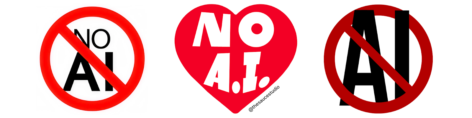
Its biggest strength is immediacy. There’s no ambiguity, no learning curve. But as a long-term, globally adopted mark, it begins to feel restrictive. The reliance on text creates challenges across languages. The tone is also inherently negative, framing the message as rejection rather than reassurance – something brands may hesitate to adopt, especially if they use AI elsewhere in their business.
Key considerations include:
- Strong clarity, but heavily language-dependent
- Scales well visually, but text and detail can break at smaller sizes
- Works across formats, though can feel more like a warning than a badge
- Risk of being interpreted as anti-technology rather than pro-human
- Limited flexibility across different brand identities
Ultimately, “No AI” works as a quick signal, but struggles as a universal, future-proof identity.
AI-Free: A Safer Alternative?
“AI-Free” softens the tone immediately. Compared to “No AI”, it feels less like a restriction and more like a product attribute – closer to labels such as “sugar-free” or “gluten-free”. That subtle shift makes it more commercially appealing and easier for brands to adopt without sounding anti-technology.
It also opens the door to more structured systems. Certifications like Mindstar or emerging “AI-free” standards suggest a move towards governance, something essential if the label is to carry real weight. However, this introduces its own complexity: without a single recognised authority, multiple competing standards risk diluting trust rather than building it.
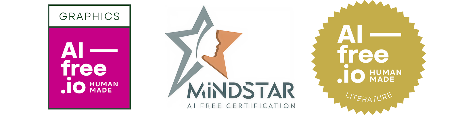
Key considerations include:
- More positive framing, but still reliant on language (“AI” isn’t globally consistent)
- Works well across platforms, particularly in packaging and digital badges
- Certification models add credibility, but fragmentation is a real risk
- May age better than “No AI”, though still tied to evolving definitions of AI
- More adaptable to different brands, but lacks a universally recognised system
“AI-Free” is a step closer to something scalable, but – without alignment – it risks becoming just another label in an already crowded space.
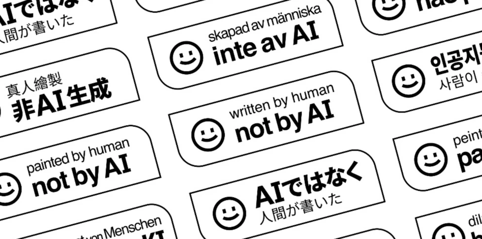
Human-Made: The Most Positive Framing?
“Human-made” shifts the conversation entirely. Rather than rejecting AI, it focuses on what something is – crafted, authored, created by a person. That positive framing makes it far more aligned with how brands typically communicate value, particularly in sectors where authenticity and craftsmanship matter.
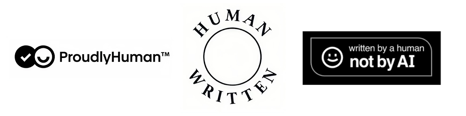
It also opens up more expressive visual territory. From hand-drawn marks to softer, organic forms, there’s greater flexibility to create something that feels distinctive rather than instructional. However, this comes at the cost of clarity. Without referencing AI directly, the meaning can feel less explicit, especially in fast-moving or global contexts.
Key considerations include:
- Positive, brand-friendly framing that avoids sounding anti-technology
- Less reliant on prohibition symbols, offering more visual flexibility
- Still language-dependent, with translation and phrasing variations to consider
- May lack immediate clarity without supporting context
- Better suited to long-term use, as it focuses on human value rather than AI trends
“Human-made” feels like the most sustainable direction, but only if it can communicate its meaning as clearly as it communicates its intent.
Designing Trust in an AI World
The demand for transparency isn’t going anywhere. People want to understand how things are made. They want clarity, honesty and trust. But translating that into a single, universal logo is an incredibly complex challenge.
Because this isn’t just a design problem. It’s a question of governance, consistency and shared understanding.
If you’re thinking about how to communicate trust in your own brand, you need to build a system that makes sense to your audience and design it in a way that’s clear, consistent and meaningful.
That’s where thoughtful design makes the difference.
Need help shaping how your branding communicates trust in a changing landscape? We’d love to help. Get in touch with TH3 and let’s start the conversation.