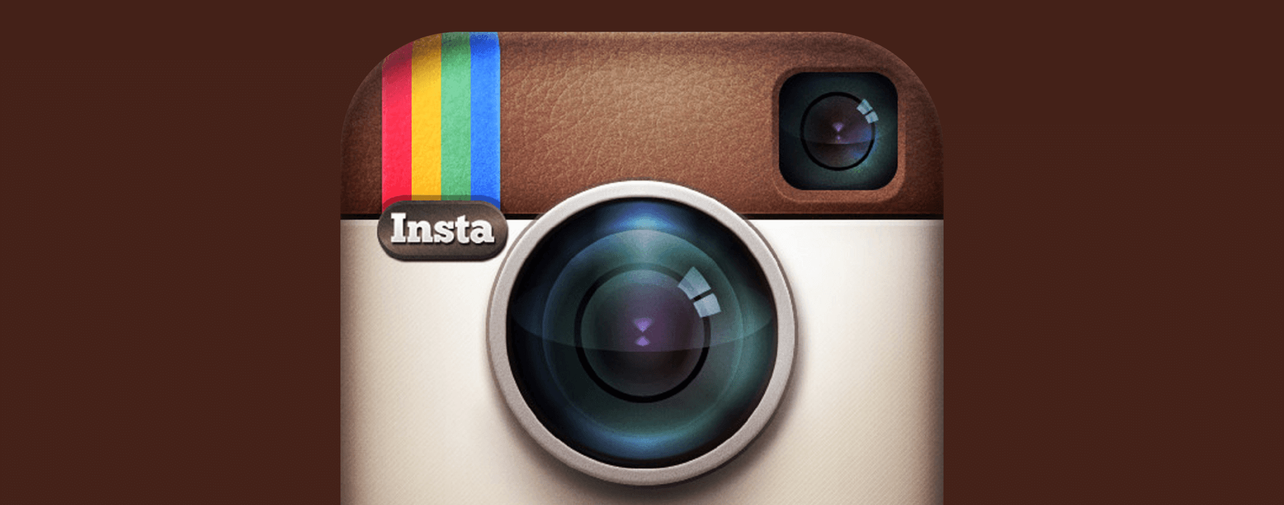
In the modern day, companies are constantly updating their identities to represent the ever changing communities around the world. The latest to do so is Instagram, the photo sharing social platform finally evolving it’s logo design and layout; causing controversy in doing so.
The new logo has split Instagram’s many users. Sort of like social media’s own marmite. Many feel the logo is bright, vibrant, and gives Instagram a fresh new look. With it’s new flat design aesthetic, rendered in vivid colours and simple lines, it has gone from it’s old time camera to a square symbol that merely evokes a camera. And a majority of the internet has freaked out.
Simplicity was the main goal of the rebranding, Instagram stated in a post. However, many feel the existing logo didn’t actually need to go. Almost identical to the reaction to Uber’s logo change, many felt change wasn’t needed. As humans we form emotional bonds with brands and logos, as strange as that sounds. And by removing a logo that has been present since it’s origins, and with no clear reason to do so, a lot of people will miss the old icon.
The layout itself is primarily black and white, and is generally seen as a stylish, sleek new layout. As some say, less is more, and the app with over 400 million users has certainly gone back to basics with a design that gives more space to the photos, videos, boomerangs and hyper lapses shared on Instagram. In fact, apart from in-app notifications, the only spots of colour present will come from users’ content.
Although Instagram users are split over the logo, most seem to agree that the new layout is a greta improvement, enhancing the experience for everyday users. The whole debate over the logo will soon die down, and we’re sure the new logo and layout will become synonymous with Instagram, becoming it’s new, modern identity.

