
What is responsive design?
A responsive design simply means a website that has been constructed so that all of the content, images and structure of the site remains the same on any device. For example, when a user accesses a site on their desktop, they are getting the full view of the site. But when that same user goes to visit the site from their smartphone or tablet, the site will retract to fit on the smaller screen.
In other words, with a responsive website design, you don’t have to have worry about having different websites for various devices or making sure that your site runs properly on a mobile device.
There are several reasons why we believe you should make the switch to responsive design for your website.
Mobile Usage is Increasing
Take a step into the outside world and you’ll definitely notice a lot of people on their mobile phones. In fact, it seems that just about everyone is attached at the hip with their smartphone. For some reason, there are many businesses that have not yet picked up on this trend. However, mobile usage has skyrocketed – see the stats below.
• More than 20 per cent of Google searches are now being performed on some sort of mobile device.
• In 2012 over half of all local searches were done on a mobile device.
• 25.85 per cent of all emails are opened on mobile phones, with another 10.16 per cent being opened on tablets.
• In 2014 mobile Internet usage is expected to overtake desktop usage.
• Out of the 4 billion mobile phones in the world, 1.08 billion are smartphones and 3.05 are SMS enabled.
Recommended By Google
Why does Google prefer responsive design? For starters, it’s more efficient for Google to bot crawl the site and then index and organise all the content that is online. The reason for this is that with responsive design, all sites have just one URL and the same HTML across all devices. When a business has both a mobile site and desktop site, there will be a different URL and different HTML for each. This forces Google to crawl and index multiple versions of the same exact site.
Also, when there is just one website and URL, it’s much easier for users to share, engage and interact with the content on that site as compared to a site that has different pages for mobile and desktop users. Google is a fan of that as well. Why? Because what if someone shared a mobile site on a social media outlet and one of their connections viewed that mobile site on their desktop? That viewer would then be viewing a less than optimal site because it was intended for mobile. This makes the user unhappy.
Google realises that unhappy people will go elsewhere, meaning that bounce rates increase and the site will not rank on mobile searches. This creates a whole big headache involving Google’s external link algorithm and on-page errors. Which in turn, also harms your SEO. In other words, it’s just bad for business for both Google and all of the websites that aren’t taking advantage of the benefits of responsive design.
Can Increase Conversion Rates
Besides all of the search benefits, as well as making users happy, responsive design has the ability to increase those coveted conversion rates from all of the mobile users in the world. Why? Well, if a website is not working on mobile or tablet device, users will obviously be unable to convert. And how many people are doing online shopping from a mobile device? There has been research that found 69% of tablet users shopped on their device within the last 30 days.
So, when a user has to do more work than needed to complete a conversion, do you think that they will still convert? It’s less likely they will convert. However, there’s a little more to it than that. For example, since a responsive website design can adjust to any screen, developers have control on how all of those conversion elements will display on mobile and tablet.
Finally, responsive design allows you to do some important high-end heat mapping and A/B testing. This means that you can segment users by mobile and gain a better picture of how those users are interacting on your site. When you do this, you can discover what sales tactics and marketing strategies are effective, as well as, those that are not. When you have this information, you can increase conversion rates.
Social media has also now gone mobile, which you may have noticed. How important is mobile for social media users? 55% of social media consumption now happens on a mobile device.
This is a really vital stat because what’s the point of sharing content on social media if it’s not compatible with mobile devices? Again, if a website isn’t functioning on a mobile device, users get frustrated and leave. High bounce rates = low conversion rates.
Better User Experience
Responsive design gives users a better experience. For example, users don’t have to fool around with zooming and shrinking the text or images on screen. Instead, all of the content automatically adjusts to the screen of the device. This makes it easier and more convenient for users to read and navigate on your site.
According to Google’s Think Insights on Mobile, whenever someone arrives on your mobile website and is frustrated, or doesn’t see the content that they are searching for immediately, there’s a 61 per cent chance they will leave and head to another website. However, whenever a user has had a positive experience with your mobile website, that individual will be 67 per cent more likely to buy a product or use a service. Furthermore, 48 per cent of users stated to Google that when a site doesn’t function on their mobile device it makes them feel that the company does not care for their business.
A better user experience also makes it easier to be reached and complain. If people are able to contact you and find a way to complain to you have a much lower probability of them going online through social media and complaining.
Easier to Manage
Going back to SEO, if you have separate desktop and mobile sites, you’re going to have to run separate SEO campaigns for each. Wouldn’t it just be easier to manage only one SEO campaign and one website? That would make not just your customers happy, but also your team including everyone from developers to content marketing managers. More importantly because you only have one site, responsive design is more cost effective as well.
Stay Ahead of Competition
In the business world, you have to stay ahead of the competition. So, if more and more users are using their mobile devices to search and make purchases online, you have to cater to that audience by having a mobile-friendly site.
Chances are that you competitors aren’t making use of responsive designs, which means that they are losing out on potential customers. And, that is where you can stay ahead and take those customers away.
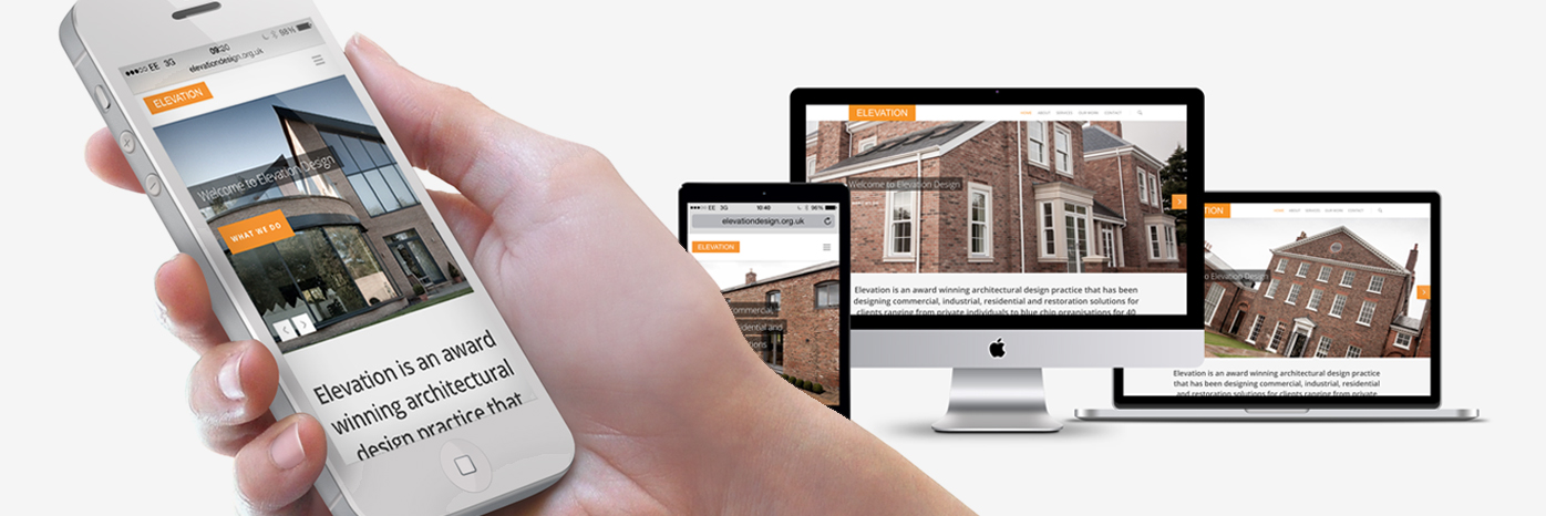
Responsive Website Launch
Our most recent responsive website to launch was elevationdesign.org.uk – take a look! Elevation is an award winning architectural design practice that has been designing commercial, industrial, residential and restoration solutions for clients ranging from private individuals to blue chip organisations for 40 years. The team here at TH3 Design have done an excellent job in creating a contemporary site that operates well on all devices.